Re: ARTS THREAD
I like the new purple reflected, but I think it could stand to be muddled. I can't think of the real word. you know, add a cast of a complimentary color to tone it down a bit. just a little.
and I like the original font and the square corners better, but that's just me. I dun like curved fonts. too bulbous. also, I meant to say I think it's a neat design too. don't mean to be only critical. :) |
Re: ARTS THREAD
Quote:
Oh and the purple I think is the same purple as on top. Though I can see what you mean that it might be popping out a bit too much because the contrast...interesting. And yes overall I think it rocks too :D |
Re: ARTS THREAD
Hey thanks for all the feedback guys!
I liked the rounded edge font, but I was trying to get Bauhaus Std. - but for some reason only "bold" and "heavy" are available when I load it in Photoshop. If you liked that one, here's one I made for my friend Mike, who's starting a new portfolio site. I literally just sent this to him today, in the same vein as the one I was doing for myself. He made the cityscape.  |
Re: ARTS THREAD
^ nice work!!
Here some Iceberg art.    |
Re: ARTS THREAD
 |
Re: ARTS THREAD
This is the sort of thing I do at work.
First scene of a project I'm working on, just a test render to see if they like the way it comes together. http://www.wausonline.com/video/car_test_h264.mov |
Re: ARTS THREAD
the "abstarct phantom" poster is wonderful! great job!
the change of font and colors is much better than the first i love it |
Re: ARTS THREAD
First typeface is best.
Good job on the kerning (y):p |
Re: ARTS THREAD
Quote:
you should be able to stretch and/or squat the text however you want in photoshop though, it makes it more natural if you're going for vintage. I personally altered the size and shape of each line of text on this piece of crap. I wanted to do more, but I had to crank it out quick and there was just so much text (I was forced) to include (they orginally had even more!) that there was no way I could make it as sleek as I wanted. 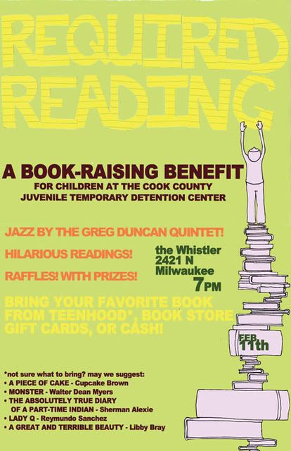 doesn't look so good on the computer machine, but it looks pretty rad printed 11x17. except for all the text. damn those words. damn them to hell. |
Re: ARTS THREAD
I guess I could have gone in and changed the text to paths and tried to slim it. Honestly, since it's for nothing but my own enjoyment - and probably won't even be on my portfolio site - I just wasn't willing. I might still try to get the font to work correctly, it's something like the font used in this incredible ISO50 piecehttp://www.merchline.com/iso50/produ...lay.5522.p.htm I'm a fan of.
I like the big text up top on your 'Required Reading' poster! :) |
Re: ARTS THREAD
whoa, there are some cool prints on that site. I like thissa one
 as for the font sizing I was talking about, I meant using the little doo hickeys that let you change the scale and what not. I'm not actually sure if you can change the thickness. I really don't know much about using computer stuff. I've only just started teaching myself. Quote:
|
Re: ARTS THREAD
New iso50 style poster.
I'm just trying to come up with ways to be productive right now. All the brushes I used on this are brushes I scanned/formatted for my company to sell.  |
Re: ARTS THREAD
 My new portfolio currently in progress |
Re: ARTS THREAD
I've been doing some of the ad competitions on zooppa. I know this isn't really fine arts, but more commercial art - but maybe someone might be interested.
 |
Re: ARTS THREAD
I went all out on this one. Retro futurism!
 |
Re: ARTS THREAD
I use to drink those brands of soda for a while but not often. Mostly they just come in small quantities than big brand sodas like coca-cola.
like the posters, keep them coming! |
Re: ARTS THREAD
fuckin sweet bro.
|
Re: ARTS THREAD
   random stuff I made on paint. |
Re: ARTS THREAD
nice ones funk (y) paint is the best.
|
Re: ARTS THREAD
Hell yeah I was on dex when I made them.
|
Re: ARTS THREAD
I enjoy making flyers..
 I am a photoshop novice, so it's not bad for me |
Re: ARTS THREAD
That's pretty awesome. You should of gone with "Time to get Raped" though.
|
Re: ARTS THREAD
I like the flyer. I dont know but its does have thise appeal of humor and the I dunno part I think comes from unsure of ummm huh... I forgot where I was going with this. Um so yeah lol I like the flyer. :)
Nice stuff too Funk. I feel like messing around on paint. |
Re: ARTS THREAD
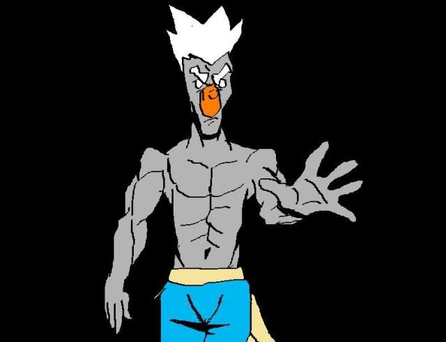
aaaw what great I had in gaming these past two months in street fighter. I finally caught myself working once again in very very long delayed work I had during January but I couldnt finish it because well, been dedicated into SF4 and of course school.
Well I'm not done but I started to make Akuma. So far that is my concept of Akuma. I just dont know. I want him to be terrifying. I want this scene to be like tale of David vs Goliath. But I dont know... I feel like Akuma need more contrast to make him you know part of the element of being a dark character. Well, I just need your advices. I need some ideas to make this Akuma become beastly.  here is a bigger view  |
 |
Re: ARTS THREAD
This thread has some really awesome stuff. I love the drawing right above this post.
This is a cartoon "music" video I did. I made the beat and stuff too. Check it out. If you feel up to it, let me know what you think. http://vimeo.com/3691297 peace, JB |
Re: ARTS THREAD
Hah, that's pretty humorous.
I just did a sketch but I feel like I could do more if I make it into a bigger work. Na§tee said I should post more of my stuff so here we go...  it's a photo, not a scan |
Re: ARTS THREAD
Very nice, digging the color and mood - is it from a model, photo, or from out of nowhere?
Here's a felted block I made for my kid. It'll be a great tool in teaching him how to spell his name and colors 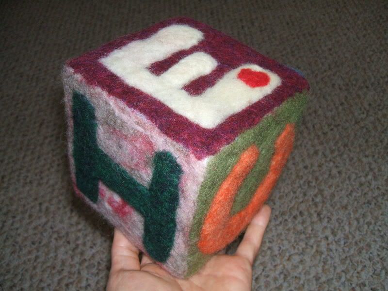 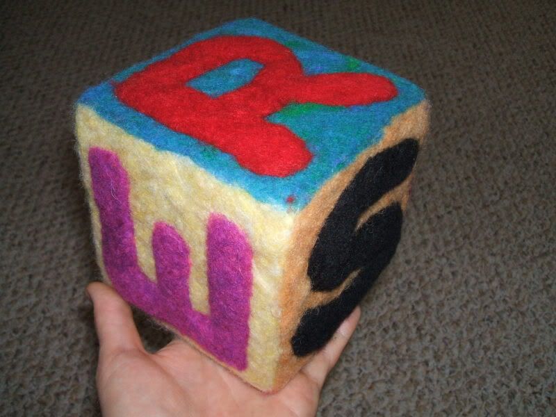 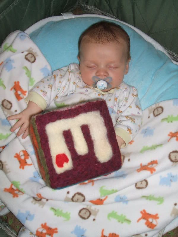 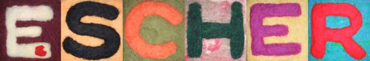 |
Re: ARTS THREAD
^That very cool, you are talented.
|
Re: ARTS THREAD
pffft, it's just wool and a needle! But thanks!
now cutting glass and making pics with it takes a hell of alot more talent! ;) |
| All times are GMT -6. The time now is 04:19 PM. |
Powered by vBulletin® Version 3.6.7
Copyright ©2000 - 2024, Jelsoft Enterprises Ltd.
Copyright © 2020 Beastie Boys